The Nautical Chart “Raster vs Vector” saga started almost 40 years ago.
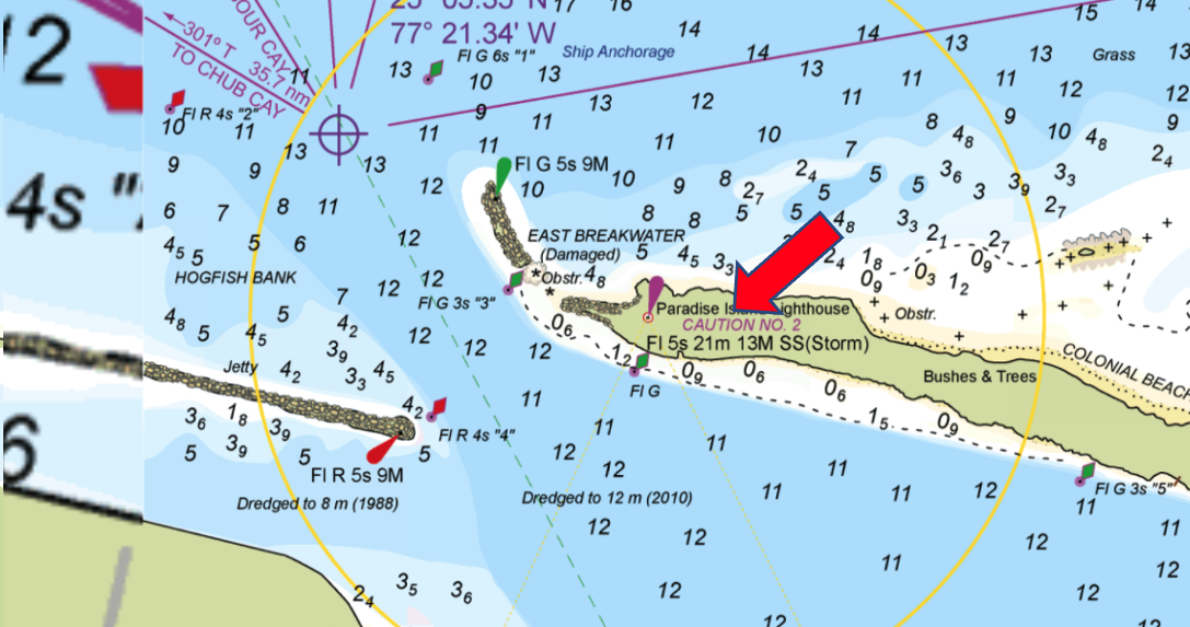
The raster image looks the same as the paper chart we were habit to, it shows all the necessary data at once, it is large enough to easily give an overview as well as the details of a certain area…
On the other side, the vector can be queried to get more info, can change the colouring of the presentation, can change the unit of measure (Explorer charts are in meters while US users are feet oriented), will not pixelate on overzoom…
Pros and cons are from both sides, but certainly the vector is the way to go.
Bahamas is certainly one of the most important areas for the Aqua Map product.
For all these reasons we decided to vectorize our product based on the famous Explorer Charts©.
The vectorization process has been quite complex compared with a classic nautical chart.
The main objective was to maintain into the final product the same (as much as possible) look and feel of the Explorer paper chart:
- Natural shade of the depth areas…light near the coastline and dark in the deep.
- The Explorer Charts are full of important Caution, Anchorages and General notes.
- Texts are very important and many times are oblique to describe a channel or a feature along its length.
- A full network of Waypoints and Recommended Routes all connected with relative distance information.
- Touristic attraction like “blue holes”, “national parks”, “marine reserves”, etc.
- Last but not least we finally integrated our product with the Light Sectors.
All this and much more, required specific objects to be invented out of the s57 standard (the international standard used by all the Hydrographic Offices in the world to produce their electronic vector charts).
Let’s see a bit of the new product.
“NOTEs” have been placed in the proper position and iconized at the higher zoom levels.
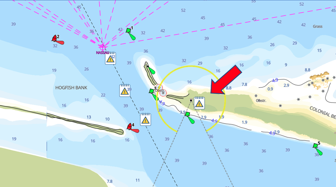
Just zoom in a bit more, or tap on the icon, and you will get the full text for that note.
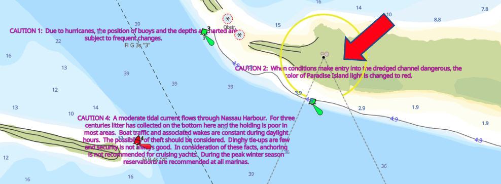
While on the raster most of the time the notes are displaced, you have to look for them all around the chart, from their real position to avoid clutter.
“DEPTH SHADING” to obtain a look and feel as much as possible closed to the original Explorer chart, we created a new style of presentation that we called “Natural” vs the current one called “Standard”.
The new presentation style is shading the shallower depths with a yellow/white colour, while using a dark blue for the deepest waters.
Chose the one you prefer.
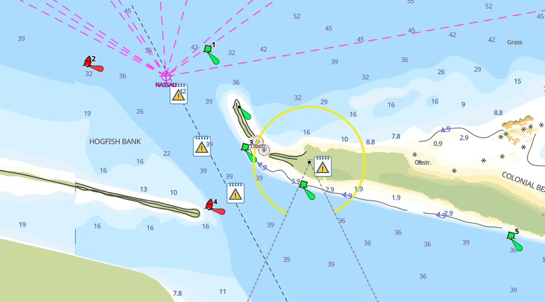
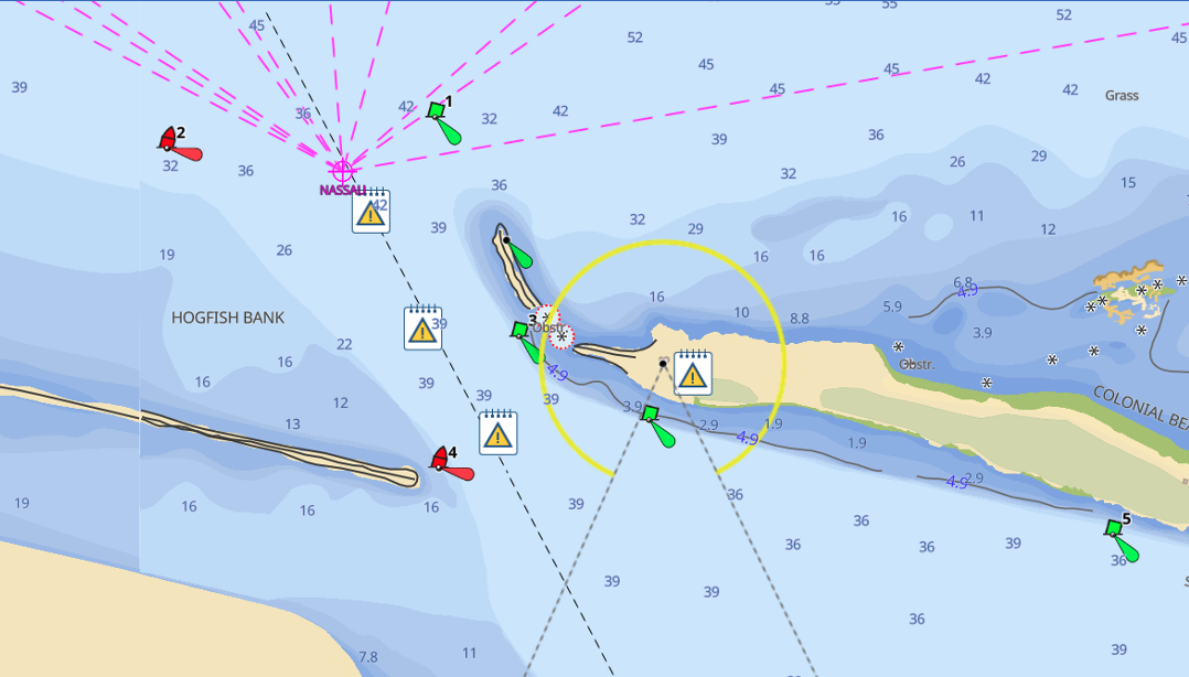
“FEET/METERS” this is the power of the vector format.
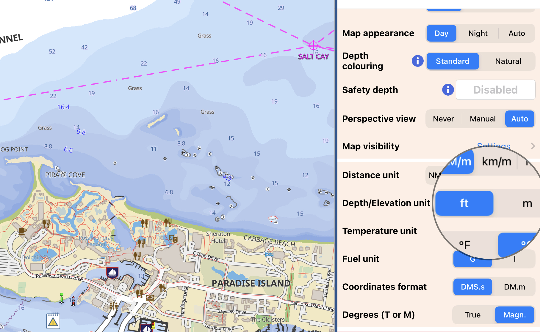
"NO OVERZOOM” the vector is certainly showing a cleaner screen…even if sometime the user loses the feeling to navigate on a low detail chart…
The app will let the user chose between Standard or Natural presentation of the vector chart, but if you still like the Raster style…open the Setting page and just switch the “Additional Raster” on.
Enjoy!
Giorgio Ghiggini, Aqua Map Team.


