Aqua Map cartographic database is built on two main key activities: research and integration.
We search the best data available from different sources: Worldwide Hydrographic Offices, other institutional organizations and private suppliers and integrate all this data into a unified database without affecting the reliability of the original data.
In the last years we added to the “basic” official marine cartography different layers of information: Tides & Currents, Satellite images, Land data, USACE surveys, USCG List of light, … We think that the integration of these different info and the implementation of the software function that makes the data easily accessible by the user of the Aqua Map app are the value added that our users can appreciate.
This articles describes the additional data and functions available in Aqua Maps obtained by the integration of the US Army Corps of Engineer surveys. These data and functions are available with the Aqua Map master subscription.
The US Army Corps of Engineering has the maintenance responsibility for more than 25000 miles of navigational channels and 400 ports and harbors throughout the United States. They provide a database of around 65000 charts of the inland water ways derived from the hydrographic surveys done along all channels to identify the bottom conditions and dredging needs.
See below an example of the value added by this data in a very interesting area, Lockwoods Folly Inlet, one of the critical area where the bottom conditions changes quite frequently.

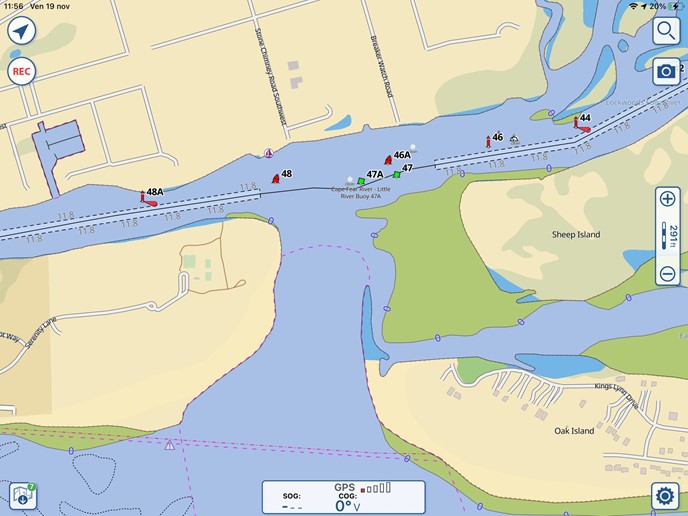
In the first image we have the Nautical chart of the area by NOAA. The NOAA cartography for this area is quite poor showing two dredged areas and a common depth area between 0 and 6 ft.

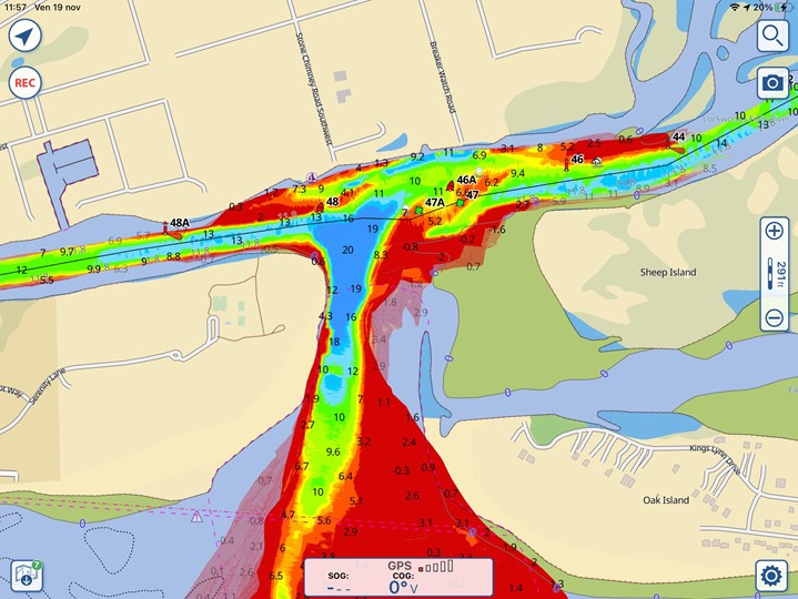
A different level of details is available if the USACE survey overlay is activated.
The USACE surveys are represented with brightly colored maps. Shallow areas are red, then the colors go to orange and yellow, green means the depth is around 10ft and blu when is deeper than 15ft. In the image it is clear where shallow areas are present and how to avoid them.
The channels conditions change frequently, new surveys are uploaded every week on the USACE database. The Aqua Map database is in continuous update to integrate the new surveys and an updated database is released by Aqua Map weekly (time subject to the availability of new overlays and the effort required for processing the data).
An area like Lockwoods Folly is covered by different surveys, the map of the area is built overlapping all the surveys assuring that each subarea is covered always by the most recent survey executed in that area. Tapping in the area a window indicating the date of the survey used is showed on the map.
To conclude let us see the settings available in Aqua Map to customize the presentation of the USACE data.
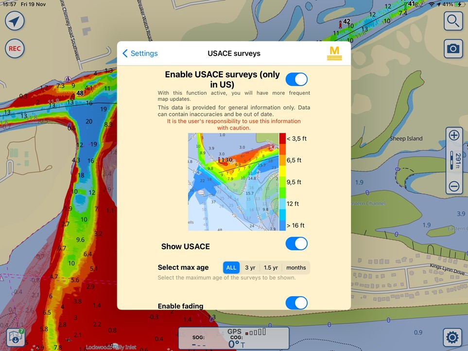
You can open the USACE Settings page form the Settings menu of Aqua Map:

With the first switch on top of the settings it is possible to activate the USACE survey data. If this is set to off the user is not warned of the new updates of USACE charts and it has to do them manually when desired. The legend shows a rough mapping between the depths values and the colors of the map.
The “Show USACE” switch determines if the USACE data overlay is drawn the map or not.
The “Select max age” option allows the user to draw on the map only surveys not older than a selected age.
- With ALL, all the surveys present in the charts are displayed.
- The other options are to show only surveys not older than 3 years , not older than a year and a half or establish the age with a number of moths before the current date.
The last options, “Enable fading” allows the user to draw all the surveys with full colors or giving a transparency to the colors based on their age.
This is how the additional USACE data overlay works in Aqua Map I hope you find it interesting and will enjoy it in the app.
Enrico Valle, Aqua Map team.


